
Primary colors are in season, once again. The bold pops of red, yellow, and blue tones are most associated with the postmodern movement of the 1980s are popping up again in contemporary art and graphic design. We drew on and experimented with mixing and matching those vibrant shades to create dynamic, well-curated spaces for our Fall Editorial collection. During the conversation between our Creative Director and Sr Manager of Brand Creative, the two talked about how excited they were to work on bringing the rich colors and funky shapes to life at our editorial shoot. We wanted to go beyond their discussion by offering a few guidelines for curating with primary colors and spotlighting the three colors themselves.
Curating with primary colors does not have to be a daunting task. Whether you are using one of those shades as the focus in a room or are mixing and matching, it's crucial to find a balance with neutrals. We suggest styling your home in two ways—designate one as the main color and use the other two and neutrals to complete the look, or create a tonal space and then layering on those pops of color. For the first option, you can start with a statement piece, like a deep red rug, a sunny yellow bed, or even a navy blue wallpaper. Then, bring in the other primary colors through an accent chair, bedside bench, or home accents. The alternative is to keep a neutral color palette, layer in pops of primary colors, and mix and match different textures and materials to lend visual and tactile impact to your space. Earth tones, light grays, and natural wood tones are all good backdrops, but black and white hues, in particular, are an ideal contrast to the primary colors. All of these neutrals help to soften the vibrancy of the saturated shades. Read on for more, including a few tips for styling with reds, yellows, and blues.

Color: Red
Red is a very emotive color, adding drama and vibrancy to a space. It inherently makes a statement, whether you're incorporating the saturated tone into your look with a focal piece like a solid heathered rug or a paprika stool. Our top tip for using red-finished pieces is to bring in plenty of texture. That means tactile fabrics, such as velvet, linen, or wool. From vases to dinnerware, ceramic accents can also introduce a more elegant feel.
-
See Through Wall Art
$649.00 -
Tate Stool
$688.00 -
-


Color: Yellow
Yellow is perceived as a bright and cheery color, evoking a sense of openness in a room. It's incredibly welcoming and engaging, so we love using it in communal spaces like the lounge, kitchen, and dining room with an oversized wall art print or velvet-wrapped chair. In a bedroom, integrate a deeper shade, closer to gold, with an upholstered bed or wallpaper. That darker shade adds a touch of sophistication while still being inviting.
-
Temi Dining Chair by Sun at Six
$580.00 -
-
-


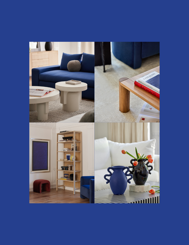
Color: Blue
Blue instills a sense of serenity and calmness in interior design. It is also the most versatile of the three primary colors, able to be neutral when paired with tonal pieces or be a jewel-toned standout. In high-traffic areas, we love utilizing blue as a striking accent, whether as a royal blue sofa in an extra large sitting room or a sculptural vase in a darker-finished dining room. For your bedroom, an indigo-hued patterned wallpaper or a gallery-quality wall artwork immediately provides deep, soothing hues to make it an ideal retreat.
-
Kennard Accent Chair
$1,898.00 -
-
-


