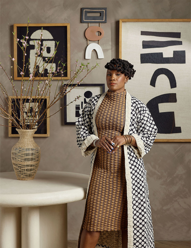
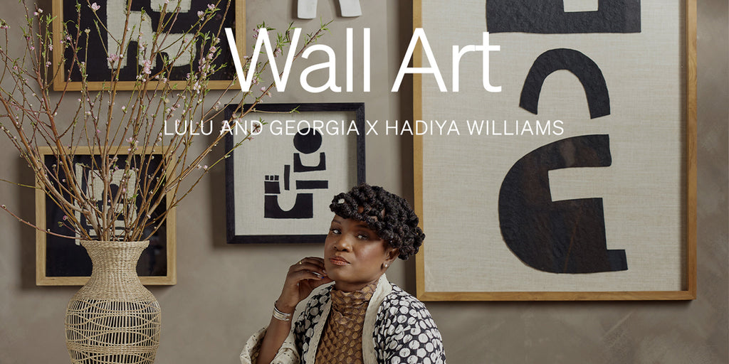
"This collection was a true collaboration but what I always like to include in my work is my continued examination of my lineage, migration, and movement."
 |
 |
Tell us a little bit about you and your work as an artist.
I have spent a lot of time trying to find my voice through my graphic design work and have developed a distinct style, but I always knew that my design was best suited for working with my hands. The exploration of Black people, our cultures, and how we move and shift ourselves for spiritual and physical survival or respite is the core of my creative work. I love connecting the dots of the diaspora and highlighting how we are all connected through space, geography, and time.
What was your inspiration when you were designing this collection?
This collection was a true collaboration but what I always like to include in my work is my continued examination of my lineage, migration, and movement. This was based on earthy and cosmic things. Bodies of water, terrain, constellations. I actually used constellations for a lot of the naming. I usually go to the census records for names of Black women. I comb over and over the records piecing together stories and trying to get an understanding of their movements. For this collection I went to the stars. All naming are representations of a gathering of energy and matter whether human or celestial.
Can you speak to the color story you chose for this collection?
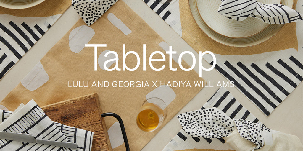
The color palette starts with black and white which is the neutral palette that is consistent with most of my work. Because this collection is inspired by earthy and cosmic things, we added some muted navy blue, a muted yellow, a terra cotta to bring in that earth and sky.
 |
 |
 |
We love the graphic patterns in your work. Any tips for mixing patterns together?
Go for it. I LOVE mixing patterns and colors in organic ways. I don’t think there is a limit or a rule that you follow. Maybe a mix of small, large, and medium for depth. I’ve been doing a lot of personal work lately that involves a maximalist approach to mixing and it is so delightful and classic.
What qualities do you like to always be present in your designs?
I like to have the presence of handmade touch in my work. I create most of my designs using hand cut paper or acrylic paint, and clay.
What does your design process look like? What are your favorite moments?
Experimentation is key in my design process. I love to wing it. I sketch a lot but when it comes down to it, I just go with the flow and let my intuition do the work. This was the case with my graphic design as well. I believe my best work comes from leading with my heart. It can be tough because sometimes it takes longer to get it out but the end result makes it worth it.
What’s next for you and your business?
I want to spend the next couple of years focusing Black Pepper Paperie Co.. in hospitality design. Creating work that is home-centered public spaces that are meant to be temporarily experienced by many but can leave a lasting impression. One of my favorite things is hotel stays. I love boutique hotels and the care and detail that goes into the decor. It’s a full experience meant to create warmth and to make people feel at home when away from home. I want BPPCo. to be a part of that.


